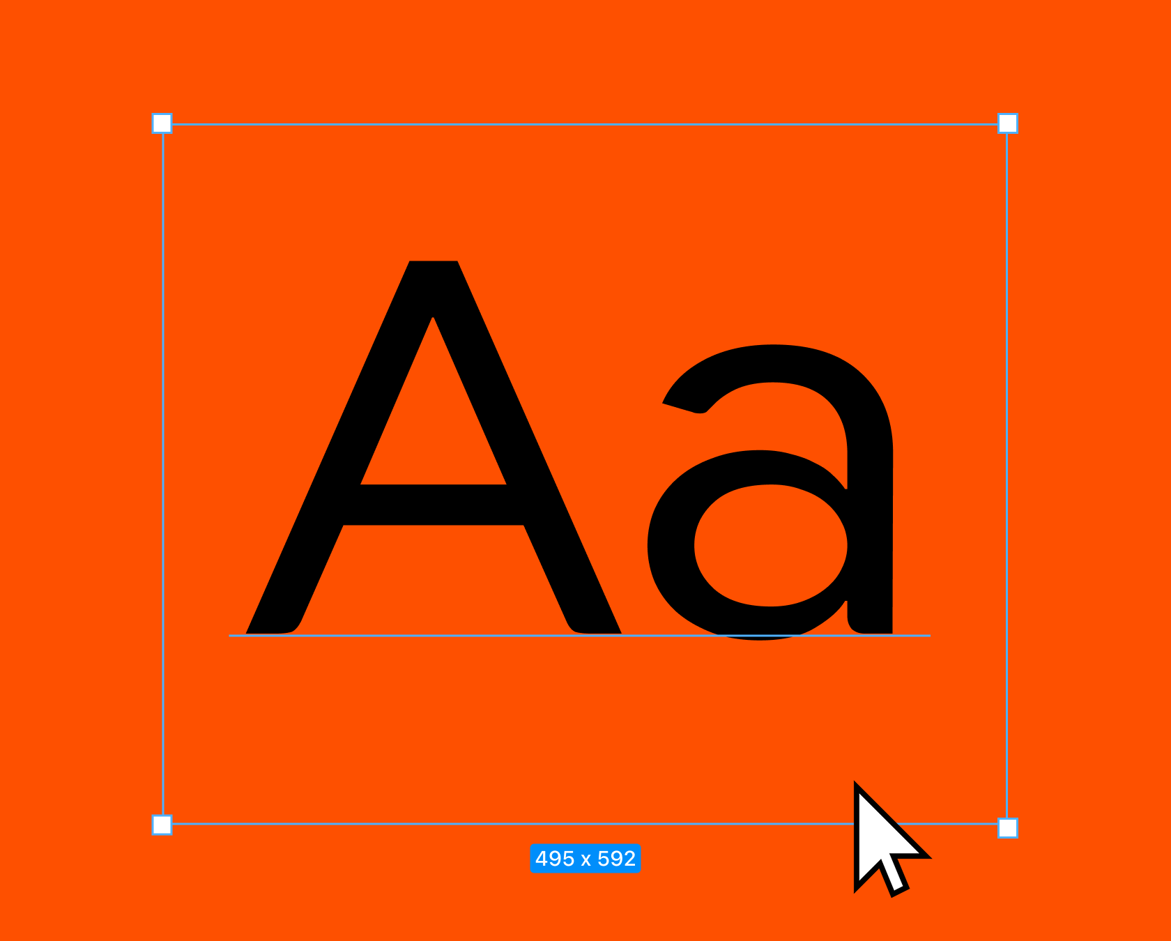
BAT.

BAT.

Introduction

Introduction

In 2024, BAT were using individual legacy component toolkits for each of their 3 different product category brands - Vuse, Velo, and glo™ - making it expensive and difficult to manage. They wanted to consolidate these into ONE global tokenised Design System that would power all 3 and provide a unified online UI experience across all their sites. The overall objective of this was to improve the governance, efficiency and consistency throughout the digital design process.

Year

2024

Industry

Tobacco

Scope of work

/

Design System

/

UI

/

UX

/

Ecommerce

Services

/

Strategy

/

Audit

/

Component Creation

/

Design-to-code

/

Training

/

Maintenance

Timeline

12 weeks

0

01

variables

0

01

variables

0

01

variables

0

02

components

0

02

components

0

02

components

0

03

brand themes

0

03

brand themes

0

03

brand themes

0

04

design system

0

04

design system

0

04

design system

Challenges

Challenges

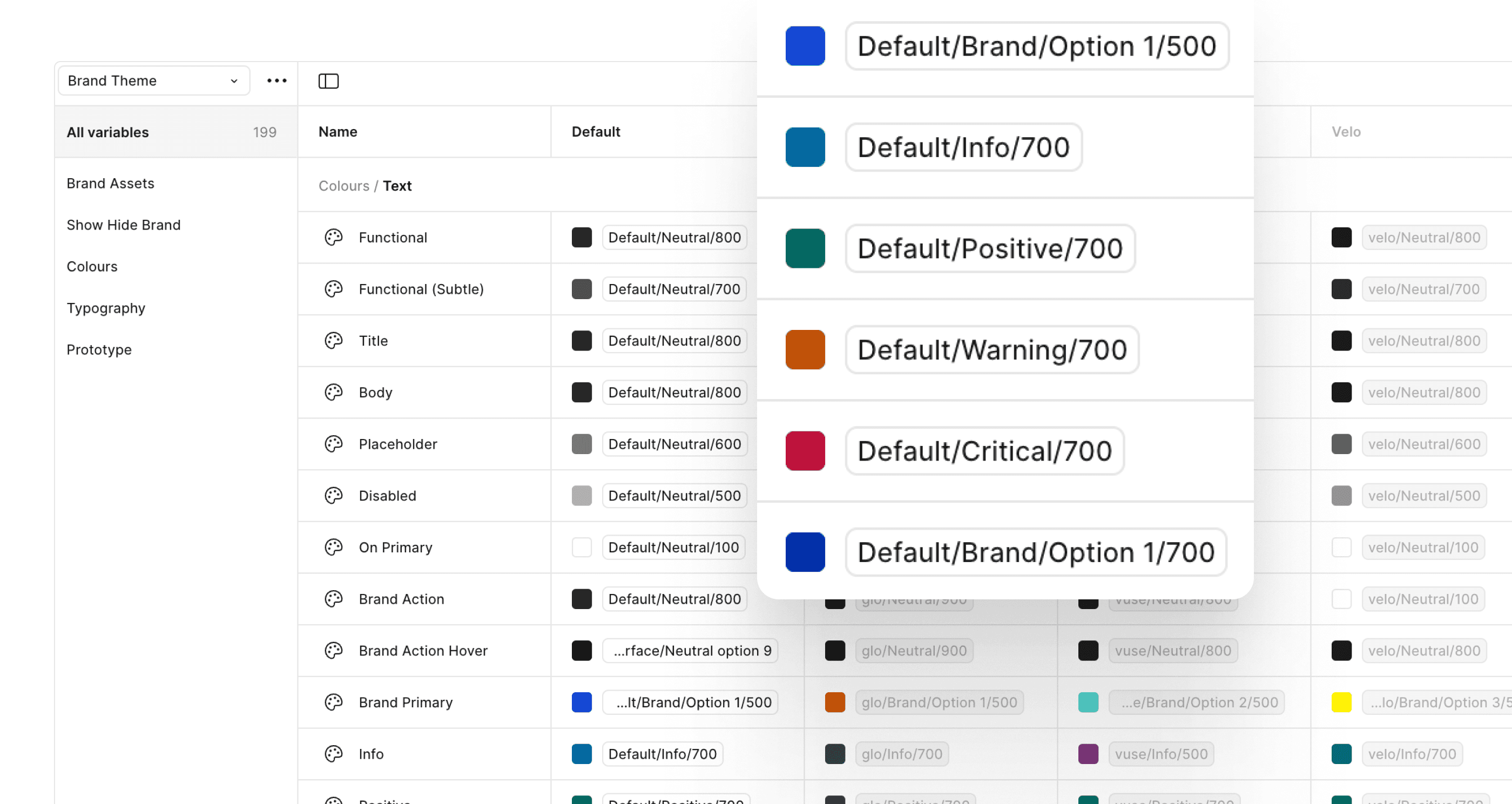
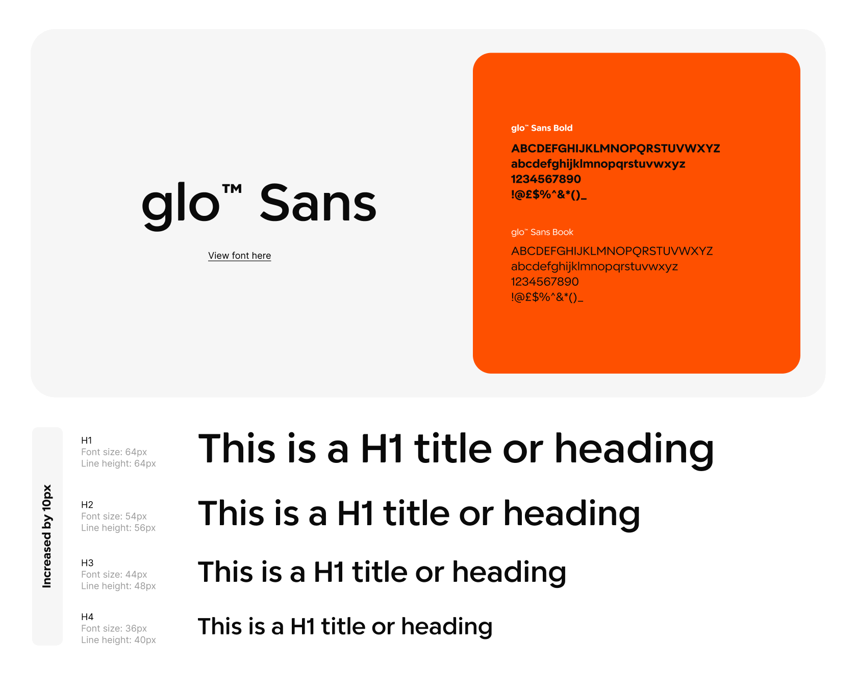
The new design framework had to work across 34+ markets and 50+ suppliers in their global network, as a single source of truth for all design and development teams. Each market had their own specific design needs, and the design system needed to create consistency at the same time as allowing flexibility for regional variations. A brand agnostic logic to the design system was required that exposed visual properties dynamically by applying specific colours, typography, spacing, and iconography to each theme.

/ Activities to meet these challenges

Scoped, defined and built the new Design Tokens structure to power all 3 brands through common reusable semantic data.

Applied the new tokenisation structure to a comprehensive and scalable component library.

Conducted training sessions for eCommerce heads and designers across the 34+ markets to ensure they understood and could effectively use the Design System.

Created a detailed onboarding document and training materials to guide markets on how to use the new design system.

glo-brand-primary

glo.primary.500

glo-brand-primary

glo.primary.500

glo-brand-primary

glo.primary.500

glo-brand-secondary

glo.secondary.500

glo-brand-secondary

glo.secondary.500

glo-brand-secondary

glo.secondary.500

vuse-brand-primary

vuse.primary.500

vuse-brand-primary

vuse.primary.500

vuse-brand-primary

vuse.primary.500

vuse-brand-secondary

vuse.secondary.500

vuse-brand-secondary

vuse.secondary.500

vuse-brand-secondary

vuse.secondary.500

velo-brand-primary

velo.primary.500

velo-brand-primary

velo.primary.500

velo-brand-primary

velo.primary.500

velo-brand-secondary

velo.secondary.500

velo-brand-secondary

velo.secondary.500

velo-brand-secondary

velo.secondary.500

CTA system

CTA system

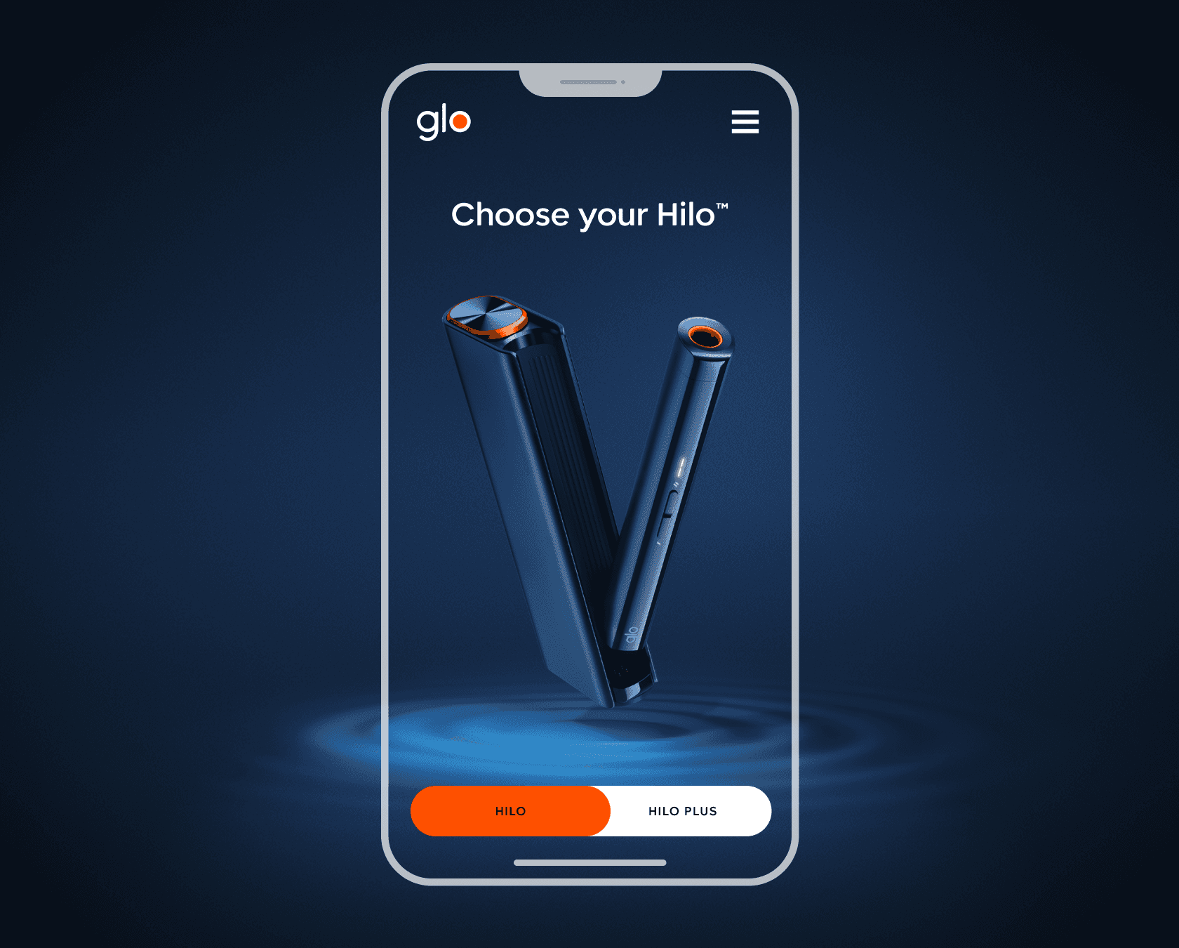
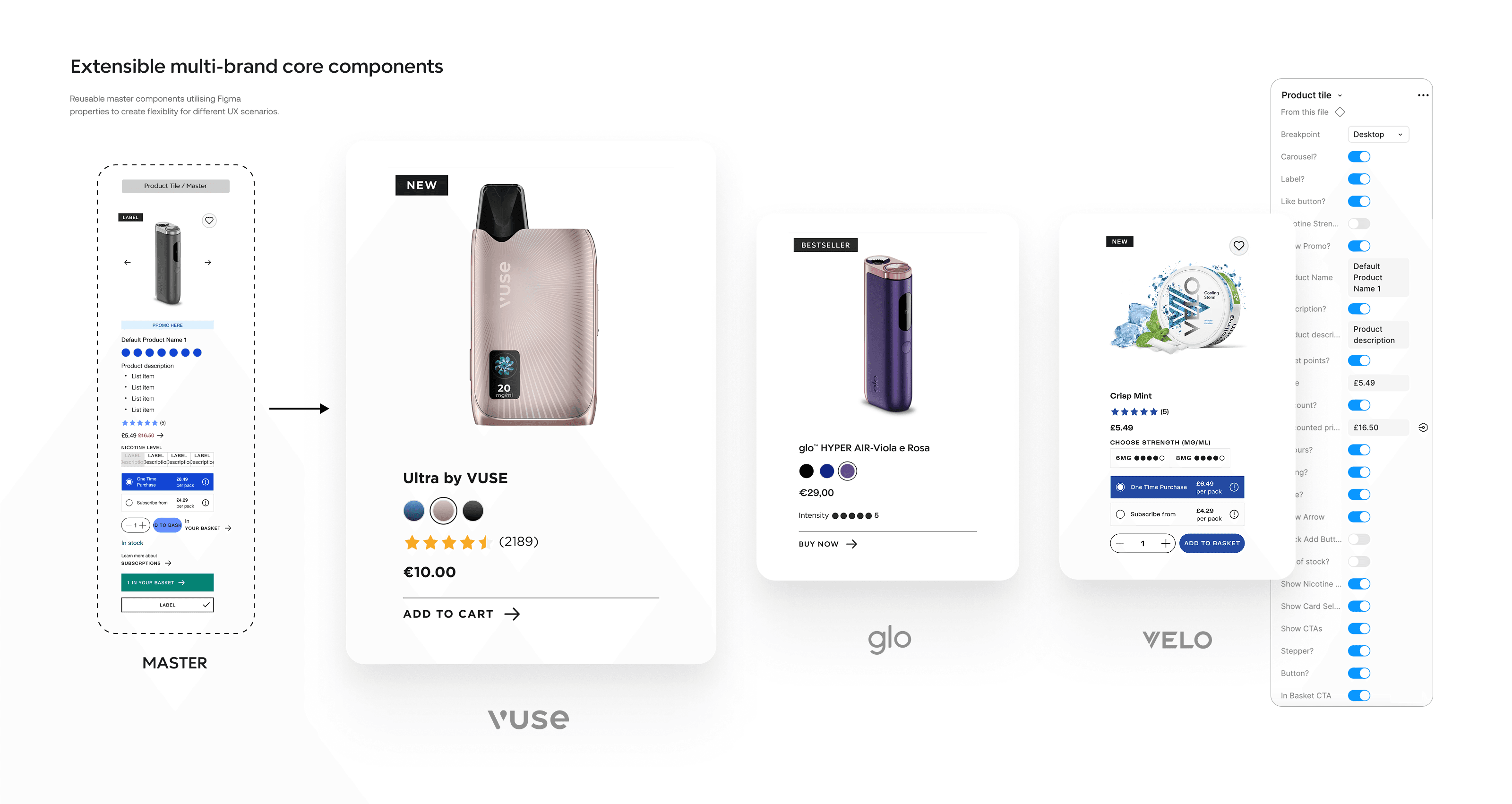
A branded CTA system was introduced through tokenisation that defined Primary, Secondary and Tertiary variants and interactives states, for clear navigation across components and pages.

glo-primary-default

glo.action.primary.default

glo-primary-default

glo.action.primary.default

glo-primary-default

glo.action.primary.default

glo-primary-hover

glo.action.primary.hover

glo-primary-hover

glo.action.primary.hover

glo-primary-hover

glo.action.primary.hover

glo-primary-focu

glo.action.primary.focus

glo-primary-focu

glo.action.primary.focus

glo-primary-focu

glo.action.primary.focus

glo-primary-disabled

glo.action.primary.disabled

glo-primary-disabled

glo-primary-disabled

vuse-primary-default

vuse.action.primary.default

vuse-primary-default

vuse.action.primary.default

vuse-primary-default

vuse.action.primary.default

vuse-primary-hover

vuse.action.primary.hover

vuse-primary-hover

vuse.action.primary.hover

vuse-primary-hover

vuse.action.primary.hover

vuse-primary-focus

vuse.action.primary.focus

vuse-primary-focus

vuse.action.primary.focus

vuse-primary-focus

vuse.action.primary.focus

vuse-primary-disabled

vuse.action.primary.disabled

vuse-primary-disabled

vuse.action.primary.disabled

vuse-primary-disabled

vuse.action.primary.disabled

velo-primary-default

velo.action.primary.default

velo-primary-default

velo.action.primary.default

velo-primary-default

velo.action.primary.default

velo-primary-hover

velo.action.primary.hover

velo-primary-hover

velo.action.primary.hover

velo-primary-hover

velo.action.primary.hover

velo-primary-focus

velo.action.primary.focus

velo-primary-focus

velo.action.primary.focus

velo-primary-focus

velo.action.primary.focus

velo-primary-disabled

velo.action.primary.disabled

velo-primary-disabled

velo.action.primary.disabled

velo-primary-disabled

velo.action.primary.disabled

Brand modes and theming

Brand modes and theming

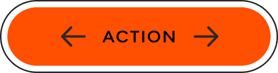
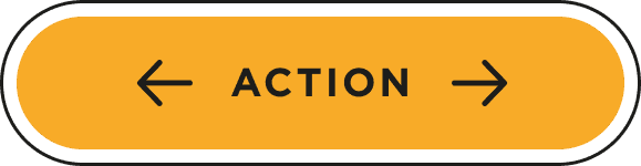
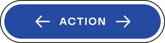
Tokenised themes for each brand facilitated a seamless transition of design through common patterns and reusable core components.

(Drag left to right below to see the transition in the brand theming)

/ Homepage Hero

/ PLP

Building extensible components

Building extensible components

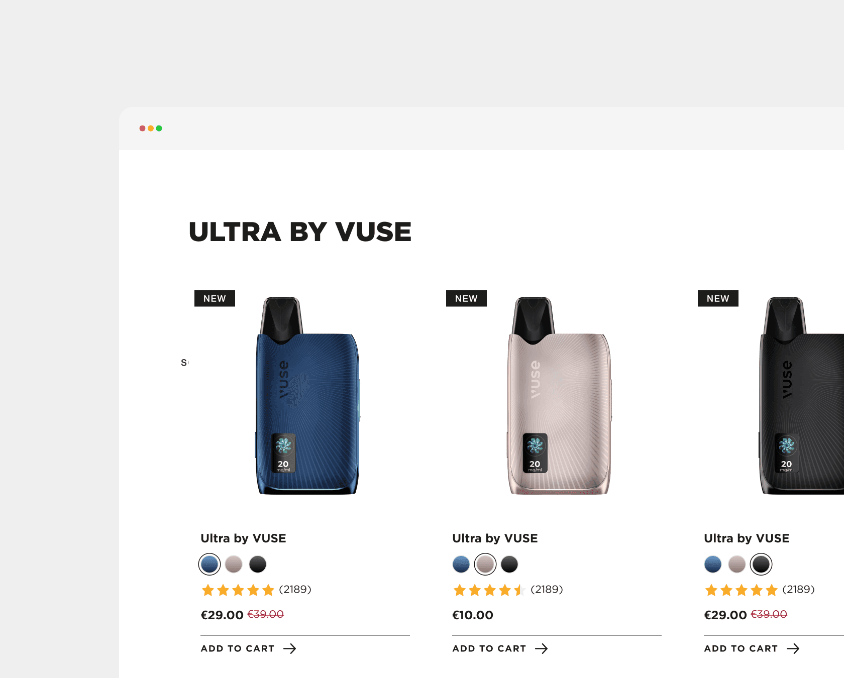
A comprehensive library of brand agnostic core components (1,355) was created to allow all product owners to build engaging user journeys that could adapt to diverse use cases while maintaining design integrity across product sites. The extensible core components enabled the develop teams to efficiently deliver consistent experiences across multiple brand platforms by separating structure from styling through design tokens and theming layers.

Governance framework

Governance framework

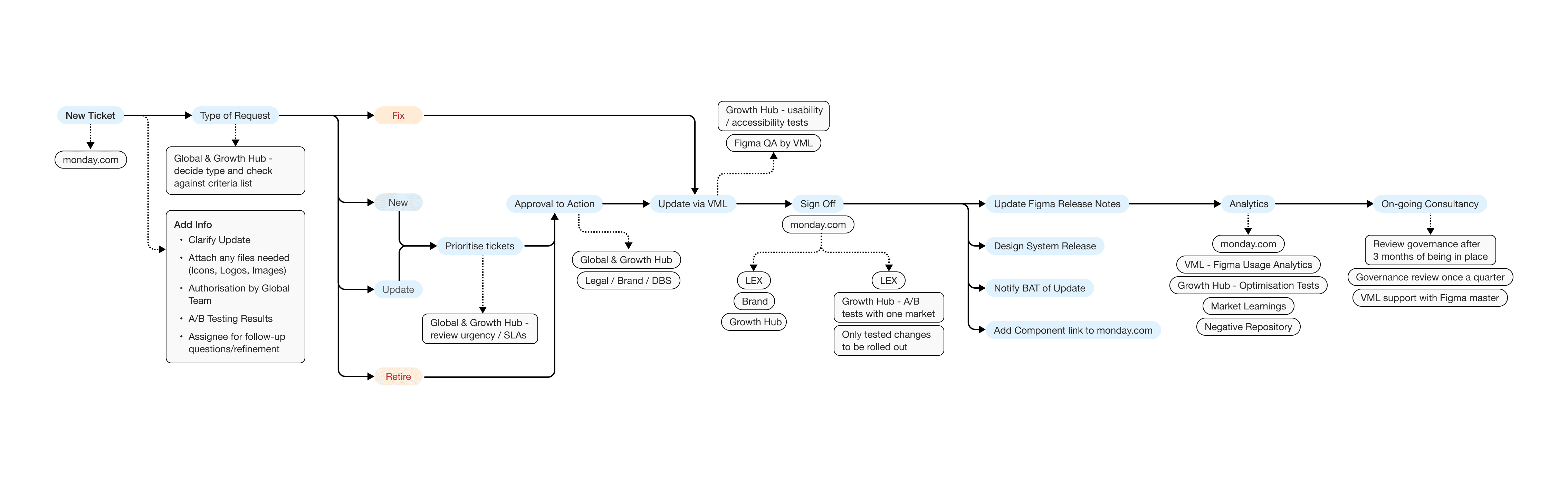
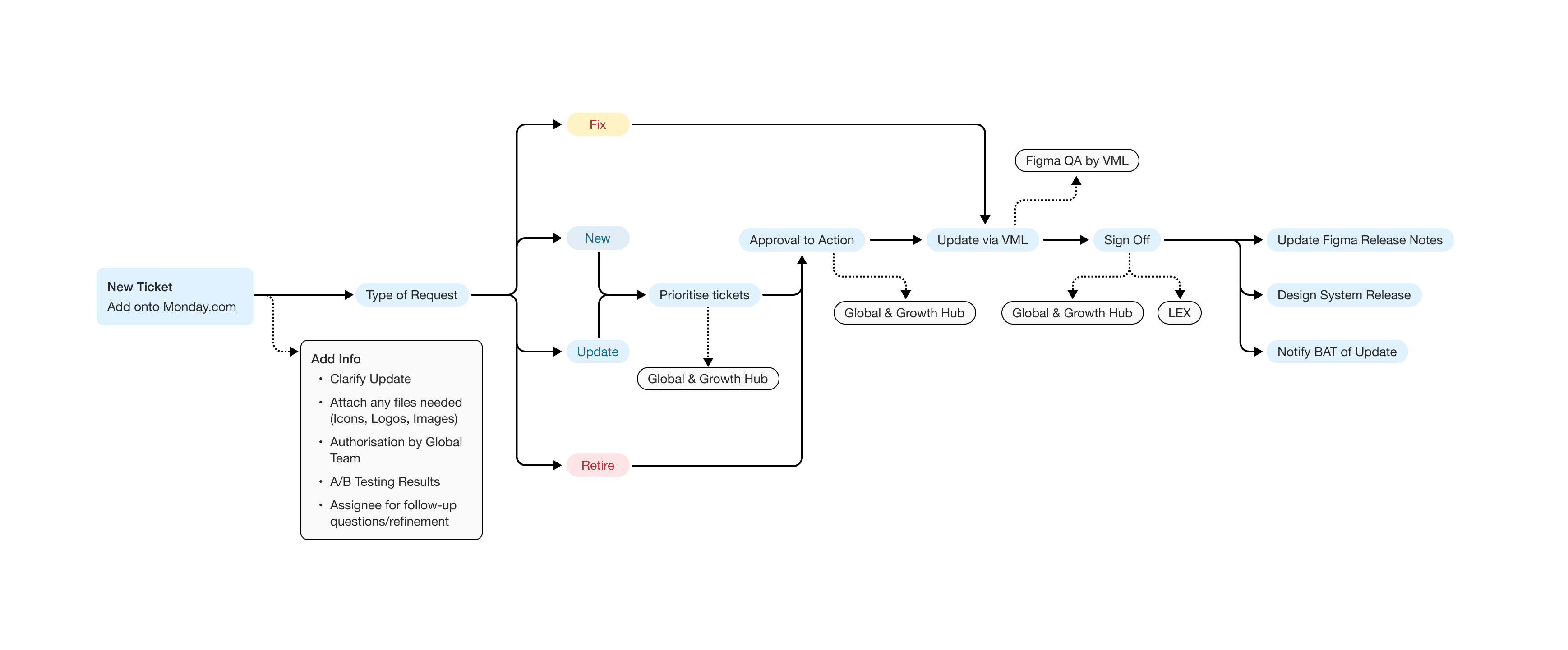
Once the design system was delivered and onboarded we began the process of defining a governance model for all teams to manage, maintain and evolve the design system going forward.

We also then delivered a training program for global suppliers.

Fix

Fix

A fix classifies as making changes to a component or style that is not functioning correctly or as intended.

Fix

Fix

A fix classifies as making changes to a component or style that is not functioning correctly or as intended.

Update

Update

Update classifies as changing and adding to a pre-existing components functionality.

Update

Update

Update classifies as changing and adding to a pre-existing components functionality.

New

New

This would be classed new when you are working from the ground up and adding completely new components.

New

New

This would be classed new when you are working from the ground up and adding completely new components.

Retire

Retire

Classing a component as ‘Retire’ means that it is completely redundant across all markets and can be removed entirely.

Retire

Retire

Classing a component as ‘Retire’ means that it is completely redundant across all markets and can be removed entirely.

The results

The results

0%

Faster development time for new digital features

0%

Faster development time for new digital features

0%

Faster development time for new digital features

0%

Reduction in design and development costs

0%

Reduction in design and development costs

0%

Reduction in design and development costs

0%

WCAG 2.2 AA compliance across all platforms

0%

WCAG 2.2 AA compliance across all platforms

0%

WCAG 2.2 AA compliance across all platforms

0%

Decrease in UI/UX-related development bugs

0%

Decrease in UI/UX-related development bugs

0%

Decrease in UI/UX-related development bugs

*Calculations are based on 1 month of stress testing production on time-recorded tasks

Final thoughts

Final thoughts

The new tokenised design system has now been introduced to the wider BAT global network and as a result created a substantially more efficient, rigorous and consistent workflow and delivery across the different markets, brands and their suppliers.

Ensuring greater consistency across all digital platforms for BAT globally.

blairjarvis.

studio

Have a project in mind?

By submitting, you agree to our Terms and Privacy Policy.

© 2025 blairjarvis.studio

Let’s talk.

Tell me about your project—whether it’s a design system, website, or branding.

Quick response.

If you’re ready to create and collaborate, I’d love to hear from you.

Clear next steps.

After the consultation, I’ll provide you with a detailed plan and timeline.

Design Director

at blairjarvis. Studio

Blair Jarvis

blairjarvis.

studio

Have a project in mind?

By submitting, you agree to our Terms and Privacy Policy.

© 2025 blairjarvis.studio

Let’s talk.

Tell me about your project—whether it’s a design system, website, or branding.

Quick response.

If you’re ready to create and collaborate, I’d love to hear from you.

Clear next steps.

After the consultation, I’ll provide you with a detailed plan and timeline.

Design Director

at blairjarvis. Studio

Blair Jarvis